
Where we started
To Go is a travel app by Västtrafik, used widely in Gothenburg. Although generally well-received, there are known usability gaps—especially concerning accessibility, interface clarity, and available services. This study aimed to identify pain points by exploring how two often-overlooked user groups—seniors (65+) and expats—experience the app.
RESEARCH & INSIGHTS
We conducted a mixed-method study using user interviews, a focus group, surveys, and a heuristic evaluation to collect both qualitative and quantitative data.
Participants
Seniors: 4 interviews, 19 in a focus group, 10 survey responses
Expats: 5 interviews, 15 survey responses
Prototype testing: ~25 users (both groups)
Key methods
Thematic analysis (qualitative data)
Descriptive and inferential analysis (quantitative data)
Tools: Figma (prototyping), Excel (data analysis), Microsoft Forms (surveys)
Core findings
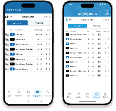
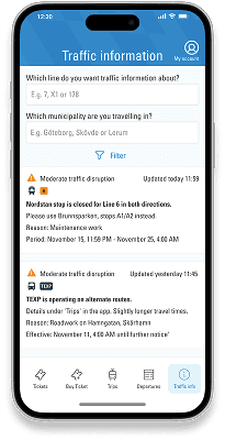
Lack of real-time traffic disruption info—especially problematic for non-Swedish speakers
Confusion around zone system and maps
Desire for more ticket options (e.g., weekly, 30/60-minute tickets)
Users often missed features already in the app due to unclear design
GPS issues, lack of tourist info, and missing filters for personalization were also raised
Design process
Empathise – Surveys, interviews and focus group
Define – Identifying key user needs
Ideate – Brainstorming & Crazy 8s
Prototype – High-fidelity prototype in Figma
Test – Usability testing and surveys for feedback
Outcome
Our high-fidelity prototype focused on:
Improved traffic info visibility, available in both Swedish and English
Simplified zone map, embedded in-app
Customizable filters for a more tailored experience
Additional ticket options, including manual activation
These updates aim to make the app more intuitive and inclusive—especially for users who aren't fluent in Swedish or are less tech-savvy.
Key Learnings
Even highly-rated apps can miss key user needs—especially for underrepresented groups
Functionality is not enough—discoverability and clarity are equally important
Design must bridge cultural and generational gaps in digital literacy
Data triangulation from diverse sources (surveys, interviews, focus groups) provided a richer perspective
Collaborative teamwork and user empathy were crucial for project success
Collaboration with Ambjörn Olsson and Tamiko Nilsson.